Seven Objects That Earn Their Place in the Studio—and How to Use Them Without Kitsch
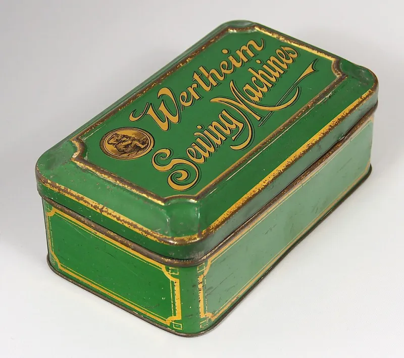
Photo: Alf van Beem, CC0, via Wikimedia Commons
Every studio I've ever admired has had a shelf. Not the styled shelf in the background of a video, which is a set dressing—an actual shelf, dusty, with things on it that nobody would buy.
That shelf is a working tool. Objects carry instructions inside them. They tell you what color to use, how fast to move, how much to leave out. The trick is letting an object teach you without turning it into a prop.
Here are seven that do real work, ranked by nothing in particular, with the honest catch on each one.
1. The sewing tin
What it carries: color and constraint.
Open a tin that's been used for forty years and you get a palette nobody would design on purpose. Thread in four shades of red that don't match. Buttons that yellowed at different rates. A pincushion stained at one corner. That sett of colors is more sophisticated than most of what's on a design trend report, because it accumulated instead of being chosen.
How to use it: sample it literally. Photograph the contents, pull eight swatches, and build a project only from those. Then take the constraint seriously the way the tin does—everything in there had to be small enough to fit.
The kitsch trap: buying a reproduction tin. Then it's a reference photo, not an inheritance. If you don't have one, thrift an actual used tin. The wear is the material.
2. A single mahjong tile
What it carries: rhythm and repetition.
One tile is a symbol. A hundred and thirty-six tiles are a system. Keep a single tile on the desk as a unit of measure—for spacing, for sequence, for the length of a section in a piece of writing or a track. The carved face is also a master class in economy: bamboo, character, dot, done.
How to use it: set it next to your screen and ask what the smallest repeating unit of your project is. If you can't answer, the project isn't built yet.
The kitsch trap: the tile as a charm on a necklace, or as a motif on a business card. Once the object becomes a logo, it stops being a teacher. Keep it in the studio. Don't put it on merch.
3. The calligraphy brush you're afraid to use
What it carries: gesture and line quality.
Almost every cultural creator has one of these and almost none of us load it. That fear is useful information. The brush rewards commitment and punishes hesitation, and it doesn't care about your fonts. Spend a week making marks with it on newsprint, then try to match that pressure in whatever medium you actually work in—type, illustration, motion, sound.
How to use it: not as a decorative flourish in a digital layout. As a control: how much of your work has that kind of pressure variance? Most doesn't. That's usually the problem.
The kitsch trap: the fake ink-dab graphic behind a headline. A brush mark that cost nothing to make carries nothing.
4. The recipe card in someone's handwriting
What it carries: structure and instruction.
Family recipe cards are the most underrated design documents in existence. They have hierarchy, abbreviation, marginalia, and a distinct argument about order. They also encode a whole theory of time: soak overnight, check at forty minutes, rest before serving.
How to use it: steal the structure wholesale. Build a project as a recipe with steps, timings, and unmarked substitutions. Or use the handwriting itself as a typographic reference for a custom letterform.
The kitsch trap: printing the card on a tea towel. There's a whole market for turning handwriting into decor, which removes the writing from its function and leaves a ghost. Use it for structure, not wallpaper.
5. A cassette or a voicemail you saved
What it carries: pacing.
A recorded voice is a timing reference. Listen to how someone from your family tells a story: where they pause, what they repeat, the detour they always take before the point. That cadence can govern the pacing of a video, an audio piece, or the sequence of images in a book.
How to use it: transcribe ninety seconds by hand. Mark the pauses. Build a piece whose rhythm follows that transcript instead of an editing style you copied from an app.
The kitsch trap: layering the recording under a montage with piano music. The moment it becomes soundtrack, it stops being a document. Sometimes the right move is to use it dry and let it be awkward.
6. The blue-and-white rice bowl
What it carries: pattern at scale.
Humble, chipped, and printed by the million, the blue-and-white bowl is a lesson in how a pattern can survive mass production without dying. It also solves a problem most visual work has: how to be busy and legible at once.
How to use it: trace the border pattern once at actual size, then once at four times the size. The bigger version will look wrong and then, with adjustment, will look inevitable. That's a lesson in scale you can't get from a photograph of a museum piece.
The kitsch trap: winking "heritage" packaging. If you're putting blue-and-white on a product, ask whether you're honoring the printing tradition or just borrowing its authority.
7. A document with a stamp on it
What it carries: restraint.
An immigration form, a visa, a ticket stub, a receipt from a shop that no longer exists. These documents are made of boxes and rules, and they contain enormous emotion without ever stating it. Look at how little ink they use to change a life.
How to use it: as a typographic constraint. Limit a project to the type, rules, and stamps of one bureaucratic document. The formality will do more emotional work than any caption you could write.
The kitsch trap: reproducing the stamp as a texture. Torn paper overlays make a border feel like a scrapbook. The document's power is in its authority, not its age.
One rule that governs all seven
Label provenance. Every time you use an object in public work, say where it came from, what era it's from, and what you did to it. That single habit is the difference between a practice and a prop department.
The shelf isn't there to make the room look interesting. It's there so you have something to answer to.